Why you don't need a separate mobile website
Monday, October 15, 2012 at 08:25AM
Tags:
webdesign,
cms,
setseed,
mobile
Filed in: Website design
Read and add comments (0)

I've noticed a lot of web designers are touting a 'mobile website' as an up-sell or separate service.
I think this is not only damaging the customer's online presence but also reflects badly on the web design industry itself.
I'm referring specifically to a separate mobile website that is built alongside your current website and requires it's own content, and therefore it's own administration. This is clearly a bad idea. You'll need to update your content in two places and more significantly your clients will experience a cut-down version of your original site.
I think the reason business are pushing this as a service is because a separate mobile site is quick and cheap to build. It only needs to work on mobiles, will contain very little content, and always has the desktop site as fallback for any inadequacies.
So how do you improve your mobile visitors' experience?
The answer is by using a 'responsive design'. This is a new technique used by the best web developers to create websites that work perfectly on all devices, including mobiles, tablets and desktops.
The brilliant thing about a responsive website is the mobile visitors to your site see the exact same content as your desktop site. All your content is gracefully reformatted and optimised for display on small screens.
If you're using a CMS like SetSeed to manage your content, you only need to change it once and visitors on any device will see your latest version.
The problem with responsive designs is they are fairly complex to build and execute well. More importantly, if you've had a website built recently, you might need to have certain parts of it altered to allow it to become responsive. If your original developer isn't willing to do this, another developer might prefer to start from scratch rather than working with your existing site.
This, understandably, is going to result in a reluctance for people to upgrade their websites to become responsive and, even worse, consider adding a cheap separate mobile site instead.
In summary: If you're looking to buy a new website now, make sure you specify it to be built using responsive techniques, and be prepared to pay a bit more for it. Rest assured it will be a wise investment. Mobile and tablet browsing is only going to get more prevalent. If you've recently had non-responsive website built, prepare to pay for a responsive rebuild and don't spend money on a separate mobile version - it's just false economy.
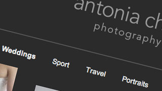
New SetSeed powered website design: Antonia Chick Photography
Monday, August 1, 2011 at 02:50PM
Tags:
design,
portfolio,
cms,
setseed
Filed in: Website design portfolio
Read and add comments (0)

Antonia Chick Photography came to Phototropic for a website that let her sell her photography prints, display her work as well as control her own content with SetSeed.
Antonia heard about us from Limited Company Band, who we've worked with for both web design and filmmaking projects. One of the reasons she came to us was because she'd heard about SetSeed and how easy it makes controlling her own content.
Having worked on a number of photography websites in the past, I enjoyed working on Antonia's site. She wanted a very 'clean' look to the site, giving her pictures the space to come across on the website.
Another requirement we had from Antonia was the she wanted to be able to offer a simple checkout system for her clients to purchase prints from a gallery. Because SetSeed has a PayPal shop, image gallery and password protection built in, we were able to set up her site to achieve this with ease.
SetSeed features used by Antonia Chick Photography:
Images and image galleries
Blog system to post news and updates
Contact forms
Flexible shop system to sell photo prints
Password protection for pages
Automatic version control and drafts
This is what Antonia Chick said about our service:
I couldn't be happier with my website. I presented Phototropic with a fairly vague initial brief yet I was amazed at how Ben actually seemed to understand me and picture what it was that I wanted. When I first saw the finished mock up, it was exactly as I had seen it in my head. Brilliant. Using my site couldn't be easier - even for the slightly more technically challenged such as myself! I have total control and can instantly update my site at any time - I can literally take a photo, edit it and add it to my site and see the result in real time. The training videos that are provided are excellent and comprehensive and the general support from Phototropic is brilliant. Very happy!
6 Steps to Improving Search Engine Ranking for Beginners
Monday, June 13, 2011 at 08:47AM
Tags:
seo,
cms,
setseed
Filed in: Website design
Read and add comments (0)
1. Create relevant page names and URLs
When you add new pages to your website you should not only consider what text you use in your main menus to link to that page, but also the naming structure used in the URL (website address) for that page.
If you use a logical and relevant name for your page, as well as the URL, the search engines will get a better idea of the content on that page. This will help your page show up when people search for your content.

When you create the page URL, you should keep to a consistent format for the text. For example, if your page is called "Website Design Guide", your URL for that page should be something like example.com/website-design-guide/ - notice how we have stuck to all lowercase and replaced the spaces with hyphens. This keeps the address looking simple and is easy for people to share. If you use spaces in a URL they will be encoded and look like this: /website%20design%20guide/ which obviously doesn't look very good.
If you use SetSeed content management system, your URLs will automatically be formatted for you, so you only need to think about the page name itself.
2. Organise your site with sub-pages
When you build your website by adding pages, you should consider your menu structure and sub-page system carefully.
If you organise your content into sections which cascade through a logical sub-menu system, your visitors will find it much easier to find what they are looking for. For the same reason, the search engines will also gain a better understanding of your content and relevant keywords.
For example, if you have several products that will all be of interest to someone searching for 'website design software', you could create a page called 'Website design software', and then add your product pages as sub-pages to that page. That way you will increase the authority of the main 'Website design software' page and increase the likelihood of that page being returned for searches for that phrase.
It's important that your page URLs follow a logical sub-page format as well as your menu structure. For example if your main page is 'website design software' with a URL of /website-design-software/ your sub-pages should be appended to that URL. For example: /website-design-software/setseed-cms/
3. Don't forget your meta title and description
When you create a page on a website, there are two important 'hidden' areas that should be given content, in addition to the main text on the page.
These are the meta title and meta description values. If you look at any page in your web browser, you'll see a single line of text right at the very top of the browser window, above the website address bar. This is the where the meta title shows up. The meta title will also be used as the title of your page in search engines the vast majority of the time.
The meta description wont show up to your visitors but search engines often use it to display along with your page in results.
For these reasons it's very important that the values for both the meta title and description are simple, relevant and will make sense to human visitors.
There is no hard and fast rule for how to write the text in meta titles and description. Indeed, a glance down a search result list will probably reveal several different approaches.
The first 70 characters of the title tag are the most important as anything after that will be cut off in the search engine result display. The role of these first 70 characters is to convince new visitors to click on your page when they see it listed in results. This is the first point of interaction between your site and your visitors.
Therefore, it will need to include the key words and phrases that they would have used to search for you, so your page is instantly recognisable as a match for their search. If you can tweak the wording to help convince them to click it, rather than just listing the keywords, you stand more chance of getting higher click-through rates from your position. There's a strong chance this higher click-through rate will in turn lead to a higher placement in the results as well.
It's debatable how useful further instances of your key phrases would be if they are used after the 70 character limit, but there are certainly plenty of high ranking pages who's title tags are truncated in the results, and include two or three instances and variations of their key phrases.
Therefore, it is reasonable to follow this format:
Your main key phrase, secondary key phrase | your branding | further variations of key phrases and keywords
Ideally keeping everything up to and including your branding within the first 70 characters.
As for the meta description: the main role of this is to provide further information about your page in the search results.
Again, if this text has the effect of convincing your visitor to click your result, you will get higher click-through rates. It is therefore important that it reads well, and isn't just a 'spammy' collection of keywords. It should of course include your main key phrases, maybe even twice, but it's primary role should be to make your page sound like it's exactly what the searcher was looking for.
There is a third meta item called 'keywords' which at one point was all the rage in search engine optimisation. However, because it's contents are never actually shown to visitors, it was often abused and is now longer used by search engines to index pages. You can still populate it if you wish, but it's unlikely to have an impact on anything.
4. Using headings to identify and organise your content
In the same way you use pages and sub-pages to organise pages within your site, you can use headings and sub-headings to organise text on an individual page.
When you create headings on a web page, there is special formatting that you must use so that the search engines can identify the headings. These codes are the equivalent of identifying a heading to a human by making it larger and bold etc.
There are several 'levels' of headings which you can use, but you will probably only need the first 4 levels.
The idea is that each page you create has one 'main heading', or 'H1'. This will include the main key phrase for the page, which will also be found in the meta title and description. Then you can use sub headings, or 'H2's, to sub-categorise your content into sections. You can then further sub-categorise your content using third and fourth level headings.
This makes it clear what your page is about and what topics you cover on the page. It identifies your content to both humans and search engines.
5. Using descriptions for images
When you add images to your pages you need to add a text description of the image so that visually impaired visitors can understand the content of the image. Search engines also use this information because they can't categorise the content of the image without it. Therefore, for both reasons, it's very important to ensure all images on your site have a proper alternative description added.
In SetSeed you can just hover over your image, click 'Edit' and click 'Add image description' to do this. If you're using HTML you need to add the description to the 'alt' tag within the image HTML code.
6. Link bating
If you want to get more traffic to your site, a good approach is to use 'link bating'. This is where you create good, relevant, content which will appeal to your target audience. This could be a collection of articles or guides which your audience might find of use as they search for solutions to their specific query (which your product or service will probably also solve).
The first step is to work out what topics to cover. Put yourself in your audiences shoes. What sort of information might they be looking for? Are they likely to be trying to solve their problem on their own without spending money on a product or service? Perhaps you could create a guide explaining how to do this, but highlight the potential pitfalls and propose the benefits of using a professional or superior product.
If your link bating content is going to work it needs to genuinely be of use to your audience. Do not just make it another piece of sales copy. If it reads as such no-one will want to share it with their friends and peers. If it's good content and provides answers to their questions, they are more likely to share links to it on Twitter, Facebook etc which will not only result in more visits but also help your page to gain authority in search engines.
Essentially, as search engines get more advanced, the similarity between making a page popular to people as well as search engines increases. If humans find your content useful, so will search engines.
Once you've written your page and made sure you've also followed the rules above regarding meta title and description, you can start promoting it. Get it out there. Post it on Twitter. Post it on Facebook. Link to it from any other sites you have. Get your friends to mention it on Twitter as a favour. The best thing about using social networks to share content is that it makes it very easy for other people to share it too. Hopefully then you'll set off a chain reaction of people sharing your page and you'll see an increase in traffic as well longer term benefits in search engines.

 Filtering email spam without risk of false positives
 Why you don't need a separate mobile website
 Great crested grebe footage used in BBC's Natural World
 Do you need a website as well as social media?
 Quick guide to �Like-gate� or �Fan-gate� pages on Facebook
 4 Quick Ways to Improve your Website Content Writing
 Website Design Primer: Common Concepts and Jargon Explained
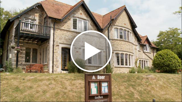
 New webfilm production: Beer YHA


